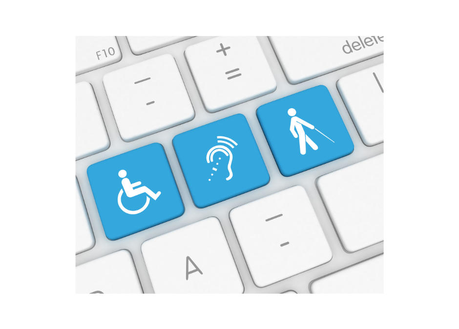
As disability awareness increases, communicators are working hard to understand how to make online content more accessible.
As a communicator who is just beginning to understand the importance of making content accessible and how to do it well, I can tell you that this is a journey that requires intention, time, thoughtfulness, and resources. While it’s not something you can do well across all your platforms in a day, there are some simple things that you can do now, to build a more inclusive online presence. Here are three accessibility practices you can start using today:
1. Use CamelCase Hashtags
I’ll keep it real with you, before hearing about this during a workshop on accessibility with Elizabeth Ralston at the 2021 Washington State Nonprofit Conference, I had never heard of the term CamelCase and it had never occurred to me to use hashtags in this format. CamelCase is writing words or phrases without spaces like we do with hashtags, BUT you indicate separation of the words with capital letters. Usually, when you see hashtags on social media sites like Twitter or Instagram, you’ll see them in all lowercase letters. However, as Elizabeth explained during her presentation, if someone is using a screen reader to read your social media post, the screen reader cannot recognize the individual words in a long, lowercase hashtag. It would try to read the hashtag as one long word, sounding like a jumbled mess. So, to make your hashtags accessible use CamelCase – instead of #inclusiveonlinepresence, use #InclusiveOnlinePresence.
2. Forget About Ambiguous Links
When sharing links in a newsletter or on websites, it’s common practice to draw attention to them using, “click here.” During “5 Ways to Make Your Website More Accessible,” a recent accessibility webinar hosted by the Whidbey Community Foundation with Scott Marlow of Marlow Five-O, Scott explained that linking in this way is not contextually helpful to visitors. It’s ambiguous and does not provide enough context to know what the link is about. A link that just says, “click here,” is not descriptive enough – click here, to what? Scott says a better descriptive link would be, “Download our annual report (.pdf),” and then link that entire line of text. Replacing the generic “learn more”, “click here”, “read more”- especially when it’s not in context – is very helpful not only to those with disabilities, but all visitors. Scott added that there’s a bonus to contextualizing your links, more clicks, “…generally speaking, text links that are seven to twelve words long get clicked on more than links that are shorter.” #BetterClickThroughRates
3. Alt-Text Done Right
Website visitors or social media followers may not be able to see the images you share. They may use a screen reader to interpret the images for them. If you’ve provided alt-text for your images, a screen reader can relay a description of the image to the visitor. WebAIM, a leading provider of web accessibility expertise says, “Adding alternative text for images is the first principle of web accessibility.” Their 2021 accessibility analysis showed that missing alt-text for images was the second most common accessibility failing. While alt-text is a priority when it comes to online accessibility, WebAIM recognizes that coming up with ideal alt-text for an image is easier said than done. In fact, it’s an area where I’ve struggled – am I adding to much alt-text, not enough, is it good enough? In their article, “How to write better alt-text descriptions for accessibility,” The Big Hack recommends limiting your alt-text to 125 characters. They say a short and specific description is the way to go, “Stick to as fewer words as possible. Is the colour of the object relevant? Is the weather in the background relevant? Does it matter what person’s hair colour is? Content authors have to make a judgement as to whether this information adds or detracts from their message.” They also recommend not describing the image as “image of” or “graphic of” in the alt-text. If there is an image, it’s usually apparent to the user. And when it comes to decorative images, no alt-text is necessary, “Screen reader users generally agree that mood, feel and aesthetic of a web page are extraneous.” Instead of alt-text, WebAIM says decorative images, should have empty alt-values and can be written as alt=””.
As communicators, creating a more accessible online presence is an area where we can help build a more inclusive society. Don’t feel overwhelmed with the process. Start simple with hashtags, links, and alt-text. These small steps can make a big difference.
Here are some links to online resources to help you better understand how to make your content accessible:
- WebAIM
- Whidbey Community Foundation – “5 Ways to Make Your Website More Accessible” with Scott Marlow
- Blog: Life of a Blind Girl
- Big Hack: How to write better alt-text descriptions for accessibility
- Twitter: Follow Alt Text Reader (@get_altText) on Twitter. Alt Text Reader will read alt text on your posted images.
- Writing great alt-text: Emotion matters
